
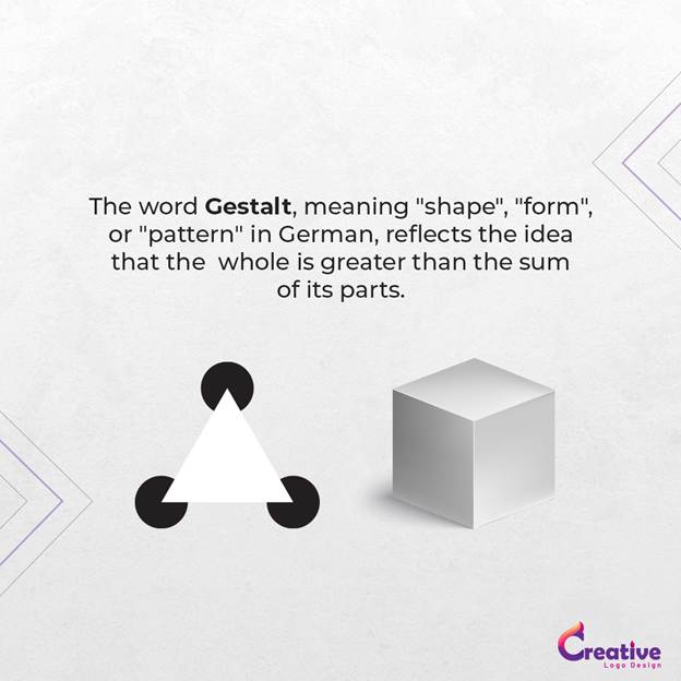
Design isn’t just about shapes, colours, or clever symbols. It’s about how people instinctively perceive and process what they are seeing. In the 1920s, German psychologists Kurt Koffka, Max Wertheimer, and Wolfgang Köhler set out to explore how the human brain organises the things it sees. Their research formed the foundation of Gestalt Theory, a set of principles explaining how our brain naturally groups elements, recognises patterns and interprets complex visuals as unified, coherent images.
Rather than analysing separate design components in isolation, our minds combine them, often filling in gaps to create a complete picture. For logo designers, this understanding is invaluable. Gestalt principles provide a reliable framework to simplify complexity, create hidden meaning, and develop logos that resonate on both a visual and psychological level.
Whether it’s through the clever use of negative space, implied shapes, or grouped elements, Gestalt Theory gives designers the blueprint to create logos that are not only visually appealing but impossible to overlook.
Great logos don’t happen by accident. Behind every iconic brand mark is a careful balance of perception, psychology, and design principles like those rooted in Gestalt Theory.
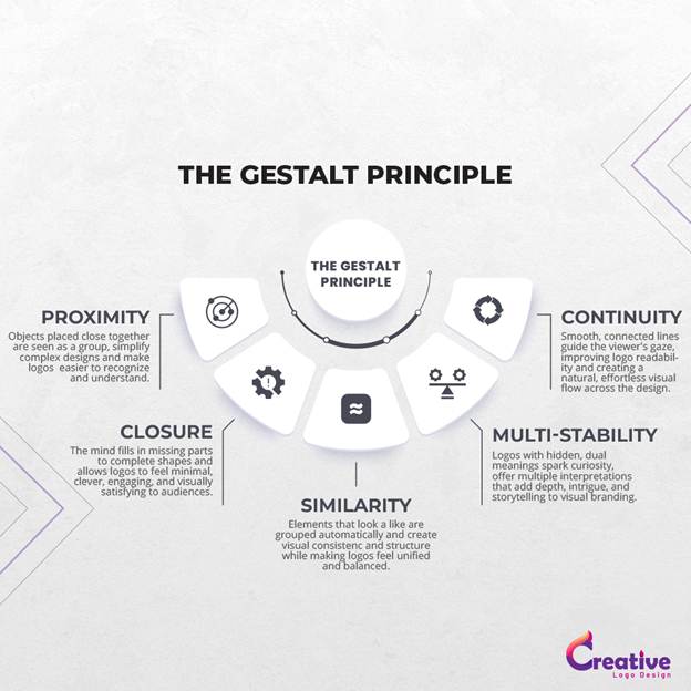
1. Proximity: Grouping Through Space
One of the most intuitive principles of Gestalt Theory is Proximity, which explains how our brains instinctively group elements that are positioned close to one another. When objects are placed near each other, we naturally perceive them as part of the same group, even when they differ in size, shape, or colour.
This principle helps designers simplify complexity and create visual unity, guiding how viewers process a logo. Used effectively, proximity transforms separate elements into one clear, recognisable symbol.
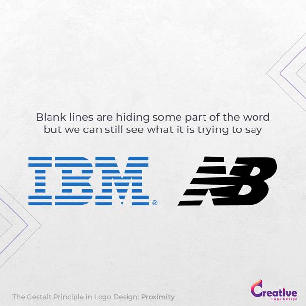
Take the IBM logo, for example. It consists of eight horizontal lines, yet because of their strategic spacing, our brains group them into the letters “I,” “B,” and “M.” Without proximity, the design would feel fragmented.
Similarly, the New balance logo. It consists of five horizontal lines, yet because of their strategic spacing, our brains group them into the letter N. Without proximity, the design would feel fragmented.
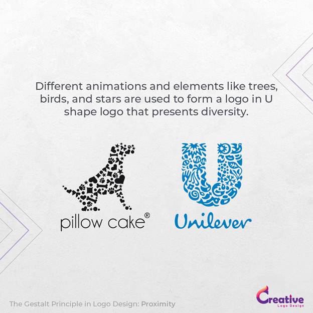
The Unilever logo offers another brilliant example, where 25 miniature icons are clustered to create a bold, unified “U.” Despite its detail, proximity ensures visual cohesion. Each symbol represents a core aspect of Unilever’s commitment to sustainable living. By clustering these icons tightly together, the design forms a unified, coherent shape that reflects the brand’s values while keeping the logo clean, modern, and easy to interpret. It’s a masterclass in using proximity to simplify complexity without losing meaning.
The Pillow Cake logo cleverly combines multiple elements using Gestalt principles, forming a heart that also resembles bones and playful shapes. This layered design reflects the brand’s focus on pampering dogs, blending love, care, and pet-friendly symbolism into one unified, memorable mark.
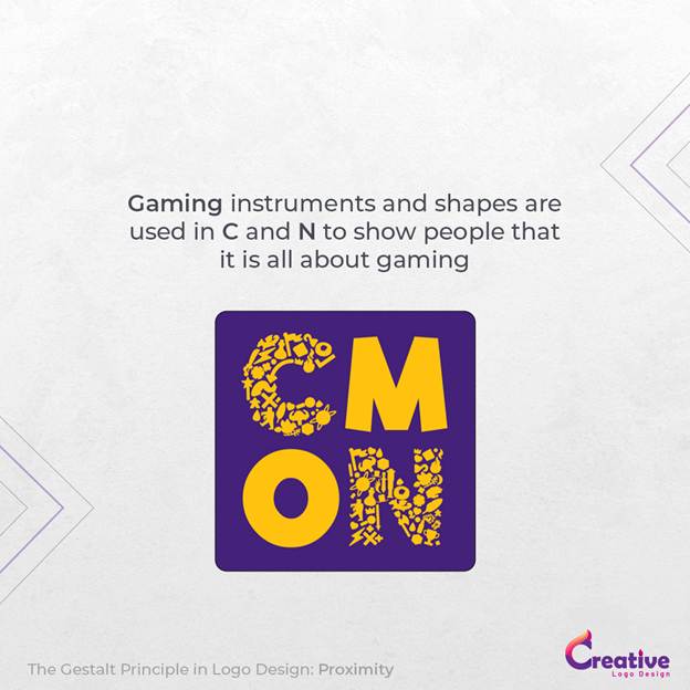
Similarly, the CMON logo, created for a gaming-focused audience, uses the Gestalt principle of Proximity to its advantage. The brand, known for producing engaging, high-quality games with detailed miniatures, playfully arranges familiar gaming elements and shapes close together to construct the letters “C” and “N.” Despite being made from individual components, the proximity between them forms a clear, unified logo mark. This design reflects the brand’s fun, imaginative spirit while reinforcing a sense of connection — much like the social, interactive nature of the games themselves.
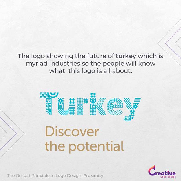
Meanwhile, Turkey: Discover the Potential uses grouped icons to create a dynamic, tech-inspired national brand mark.
In essence, this way is to highlight the Qr code future in turkey as well as the building infrastructure, which is the future of Turkey.
2. Closure: Seeing the Whole from Parts
The Law of Closure describes the brain’s remarkable ability to complete unfinished shapes or images. Humans naturally dislike visual gaps. When presented with incomplete forms, our minds fill in the missing information, allowing us to perceive complete, recognisable shapes.
This instinct is why logos that use negative space often feel so clever and memorable they engage the viewer by inviting participation in the design.
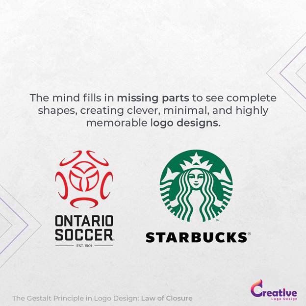
The Ontario Soccer logo uses partial rings and lines to imply a soccer ball, with a central trillium symbolising Ontario. The entire form feels complete, though it’s never explicitly outlined.
The Starbucks logo is also a great example, which is not saying that you will become a star, but it is showing a lady with a crown to demonstrate that.
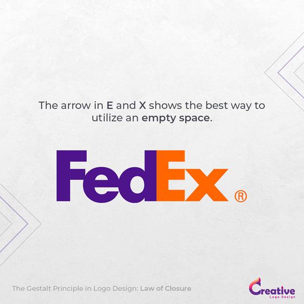
Consider the FedEx logo, where the space between the letters “E” and “x” forms a hidden arrow. Though subtle, our minds fill in the blanks, reinforcing the brand’s association with speed and precision.
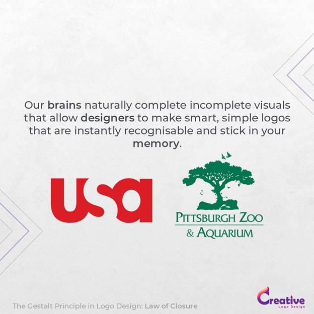
Similarly, the USA Network logo leverages closure by forming the letter “S” through the negative space between the “U” and “A,” maintaining simplicity while ensuring cohesion.
Perhaps the most intricate example is the Pittsburgh Zoo logo, which hides animal silhouettes within a tree. The lion and gorilla emerge, not through defined lines, but through carefully positioned negative space.
By leveraging closure, designers keep logos minimal yet engaging, encouraging viewers to discover hidden details while enhancing memorability.
3. Similarity: Creating Groups Through Visual Consistency
The Principle of Similarity explains how elements that share visual characteristics like colour, shape, size, or orientation are automatically perceived as belonging together. This principle allows designers to build cohesion and structure within a logo, even when working with diverse elements.
Similarity simplifies interpretation by signalling that certain parts of a design are connected, helping logos feel balanced and intentional.
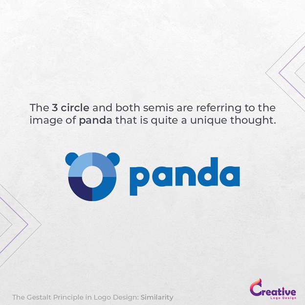
For instance, the Panda Security logo transforms a minimal panda face using consistent colours and rounded shapes. The similarity in design reinforces approachability while breaking away from overused industry symbols like shields and locks.
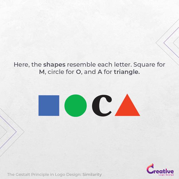
The MOCA (Museum of Contemporary Art) logo cleverly replaces the letters “M,” “O,” and “A” with geometric shapes, a square, circle, and triangle, while maintaining size, alignment, and bold colour. Despite differences in form, similarity unifies the mark.
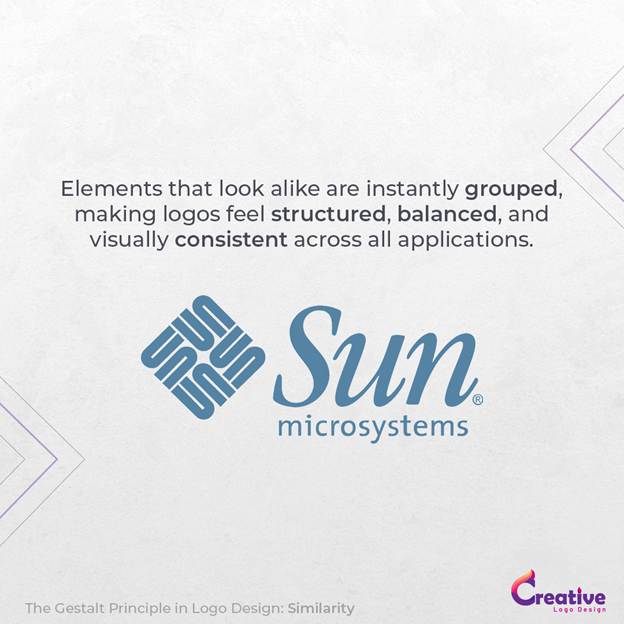
A classic example is the Sun Microsystems logo, where repeating, rotated “U” shapes create the illusion of the word “SUN” on all four sides of a diamond. The consistent treatment makes the design feel seamless and harmonious.
When applied thoughtfully, similarity ensures logos feel structured, visually consistent, and instantly recognisable across different platforms.
4. Multi-Stability: One Image, Multiple Meanings
Multi-Stability is among the most creative applications of Gestalt Theory in logo design. It refers to the mind’s ability to perceive multiple interpretations within a single image, though not simultaneously. As viewers shift their focus, the brain toggles between meanings, creating intrigue and encouraging deeper engagement.
This technique allows logos to carry layered messages, offering storytelling and surprise in equal measure.
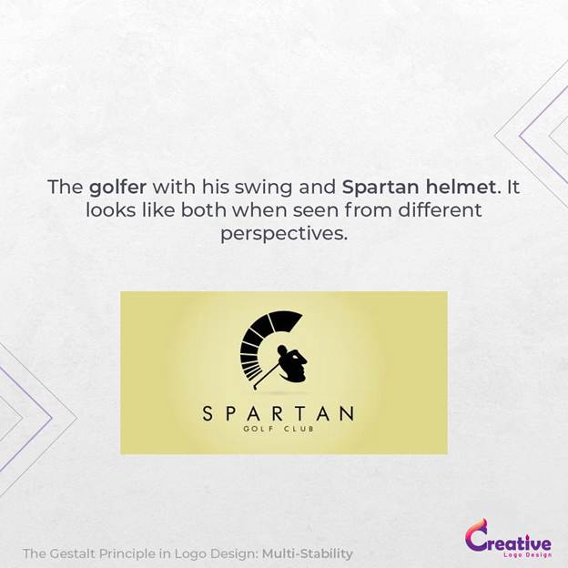
The Spartan Golf Club logo is a masterclass in duality, combining the profile of a Spartan helmet with a golfer mid-swing. At first glance, one image dominates, but look again, and the second interpretation emerges.
The ED (Elettro Domestici) logo merges the brand’s initials to form the outline of an electrical plug, reflecting both the company’s identity and its industry focus.
The Hope for African Children Initiative logo simultaneously depicts the African continent and the silhouettes of an adult and child, visually tying the mission to its geography.
Similarly, the Snooty Peacock logo blends a woman’s elegant profile with the fanned feathers of a peacock, embodying both sophistication and creativity.
Multi-stability logos demand a second look, sparking curiosity and making the design memorable long after the first glance.
The candle maker is also a great example when it comes to telling about multi-stability. Because it is showing the picture of a candle and also showing how to save it.
5. Continuity: The Eye Loves Smooth Flow
The Law of Continuity taps into our natural tendency to follow smooth lines, curves, and aligned elements. When a logo’s components are arranged along a continuous path, our eyes perceive them as connected, guiding attention effortlessly through the design.
In logo design, continuity enhances readability, balance, and flow, ensuring the viewer’s gaze travels naturally across the brand mark.
The Coca-Cola, PEPSI, Sprite, and other soft drinks exemplify this principle. The sweeping, fluid script leads the eye from one letter to the next, creating a rhythmic, satisfying visual journey that reinforces the brand’s timeless appeal.
Continuity also helps unify more complex compositions. Designers often use flowing shapes, aligned elements, or directional forms to guide attention without cluttering the design. These pathways might be literal lines or implied through shape repetition and alignment.
By embracing continuity, logos become easier to navigate, visually satisfying, and effortlessly understood. The viewer isn’t just seeing the logo. They’re being guided through its story.

Conclusion
At its core, Gestalt Theory shows us that great design is about relationships and how individual elements work together to create a unified whole. In logo design, where simplicity, clarity, and instant recognition are crucial, Gestalt principles give designers a roadmap to success.
By applying Proximity, Closure, Similarity, Multi-Stability, and Continuity, designers guide how audiences perceive and process logos. These principles leverage natural human perception, transforming scattered shapes and spaces into clear, impactful brand identities.
The most iconic logos in the world, from FedEx to Coca-Cola, aren’t just visually pleasing; they’re carefully constructed using these timeless techniques. Whether it’s hidden meaning through negative space or seamless flow through continuity, Gestalt Theory ensures that every design feels intentional, engaging, and unforgettable.
For designers, mastering these principles transforms the creative process. It simplifies complexity, adds hidden depth, and crafts logos that connect with viewers on a subconscious level.
In a crowded visual world, Gestalt Theory is the difference between a logo that fades away and one that becomes etched in memory.


